FISH ROAD
Client Story
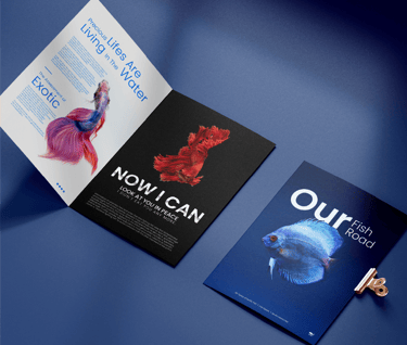
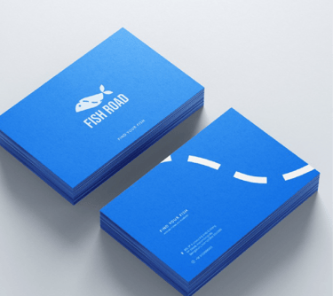
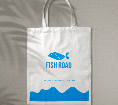
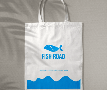
The Fish Road logo represents freshness, trust, and global seafood excellence rooted in the historic fishing town of Grimsby, UK—one of Britain’s most iconic seafood hubs. At the heart of the identity is a clean, minimalist fish icon, symbolizing purity, ocean freshness, and responsible sourcing. The smooth, flowing form reflects movement, trade, and the continuous journey from sea to international markets.
The bold, modern typography of “FISH ROAD” conveys strength, reliability, and global business confidence, positioning the brand as a professional exporter that meets international quality standards. The balance between the soft organic fish symbol and the strong structured lettering perfectly represents the brand’s fusion of nature and industrial-scale export operations.
The background imagery of freshly harvested fish in traditional market baskets reinforces:
Daily-fresh sourcing
Authentic coastal fishing heritage
Hygienic handling & premium selection
Farm-to-export reliability
What the Logo Stands For
Premium seafood exports
International trade excellence
Sustainable fishing practices
Freshness guaranteed
UK coastal authenticity
From the shores of Grimsby to global markets, Fish Road delivers not just seafood—but trust, quality, and consistency across oceans.
Fish Road is not just a brand.
It is a global seafood route built on freshness, ethics, and export excellence.